[EN]
MARIA ANTONIETA'S BRAND IDENTITY
Year: 2023/2024
Category: Food
Category: Food
Context
Maria Antonieta, a charming blend of bistro, boulangerie, pâtisserie, and chocolaterie with French roots and a Brazilian soul, has been delighting customers with excellence for over a decade.
With a rich history and a compelling story to tell, owner Mateus Matana approached us to embark on a dynamic creative partnership.
What we did in this project
Brand Strategy, Visual Identity, Packaging design.
Development
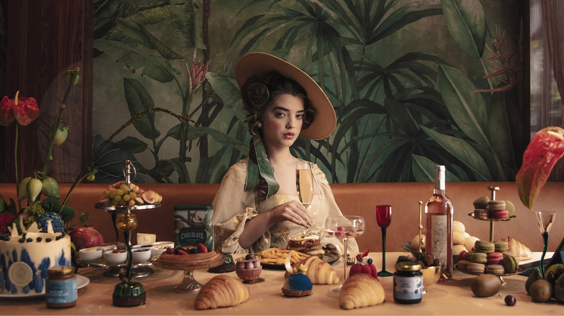
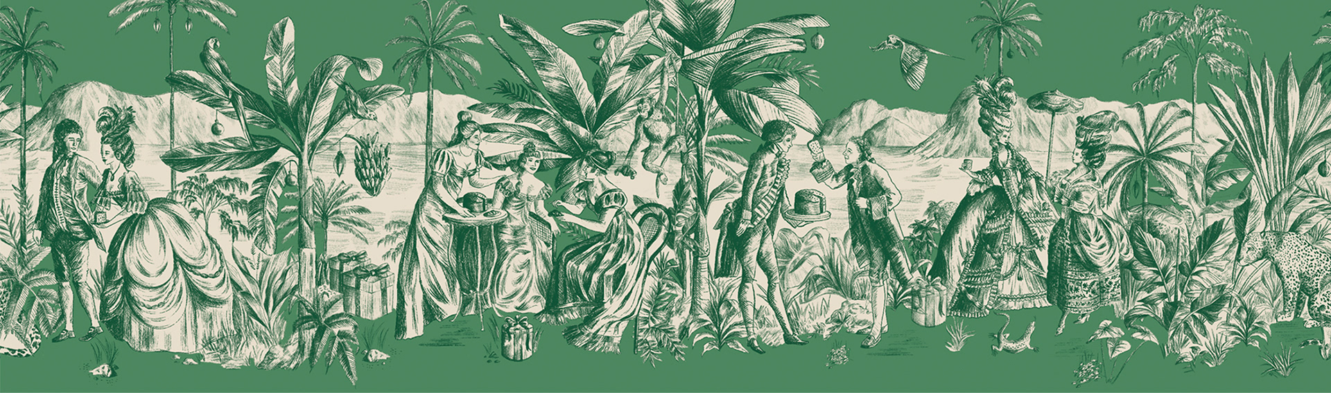
We developed a concept for this new chapter of the brand, imagining what it would be like if the French court had settled in Brazil: “As French as ever, but Brazilian like never before.”
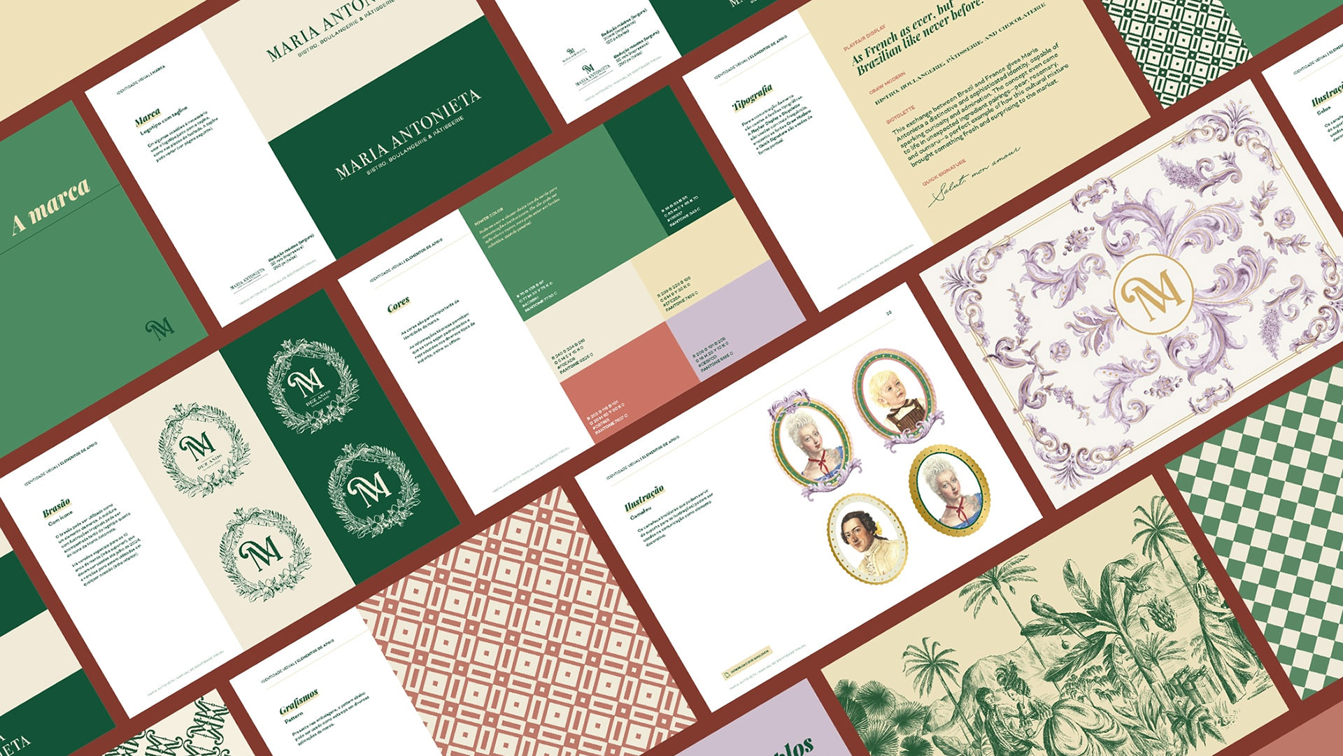
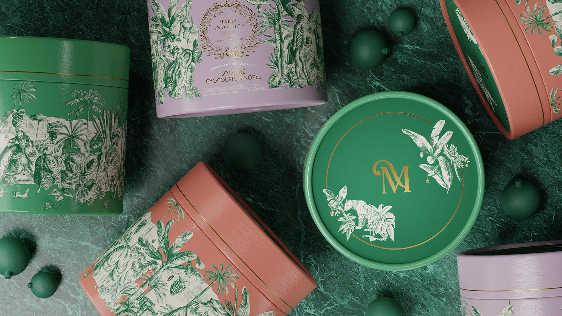
The outcome is a refined mixture of ingredients, flavors, traditions, and cultures, seamlessly blending the best of both worlds for their sophisticated consumers, those who appreciate heritage and the prestige the brand embodies. This allegory inspired every aspect of our work, from the new visual identity to packaging design.
During the creative process, we explored whether the brand’s private-label products should follow a cohesive visual language or if each could have its own distinct personality within the brand’s atmosphere. After thoughtful discussions with Mateus, we chose the latter, embracing a diverse portfolio to add richness and depth to the project. However, this approach introduced challenges: maintaining visual unity becomes more complex when there’s creative freedom to explore new elements, illustration styles, and graphic motifs. Every design decision impacts the whole project and must be carefully considered to ensure that the brand identity remains cohesive.
During the creative process, we explored whether the brand’s private-label products should follow a cohesive visual language or if each could have its own distinct personality within the brand’s atmosphere. After thoughtful discussions with Mateus, we chose the latter, embracing a diverse portfolio to add richness and depth to the project. However, this approach introduced challenges: maintaining visual unity becomes more complex when there’s creative freedom to explore new elements, illustration styles, and graphic motifs. Every design decision impacts the whole project and must be carefully considered to ensure that the brand identity remains cohesive.
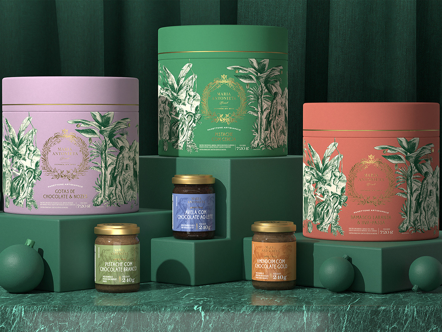
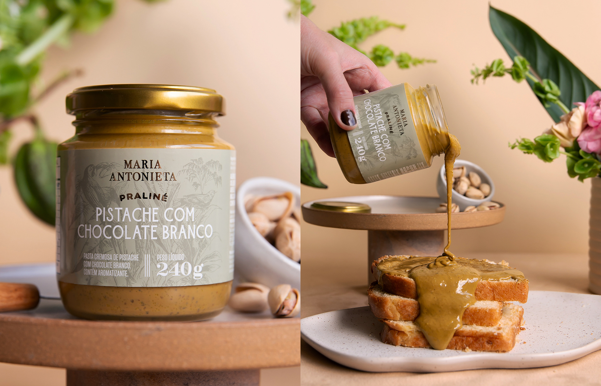
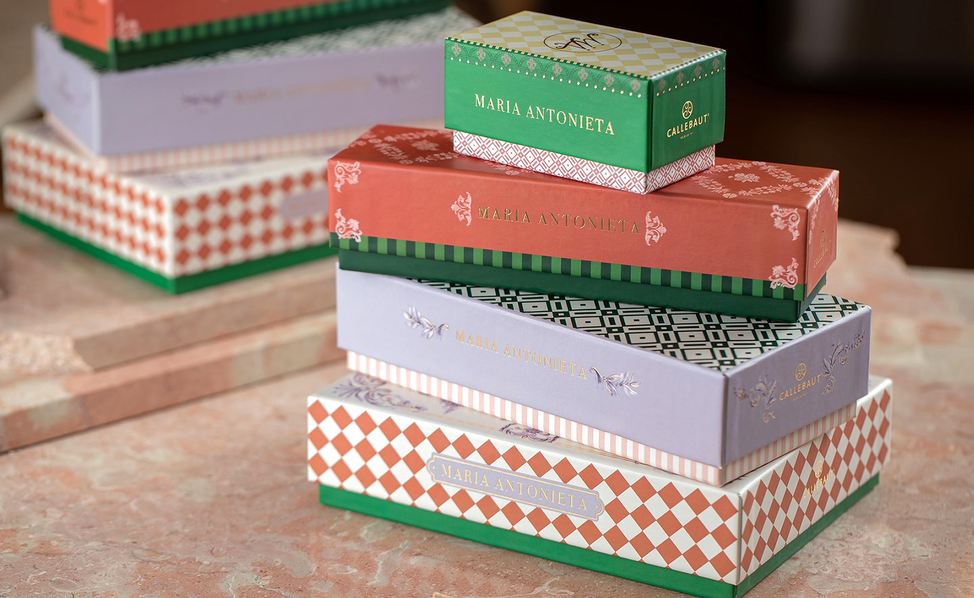
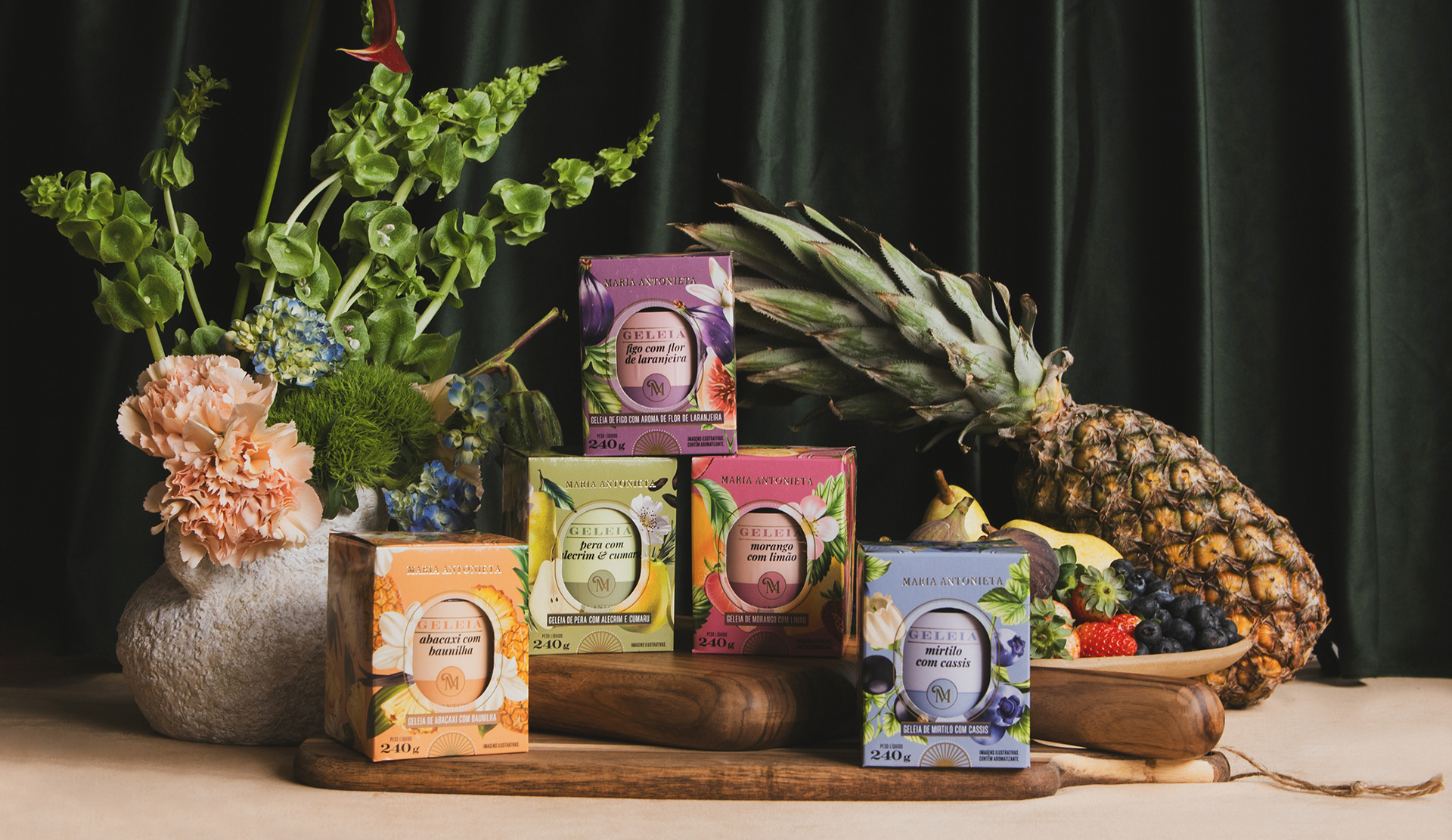
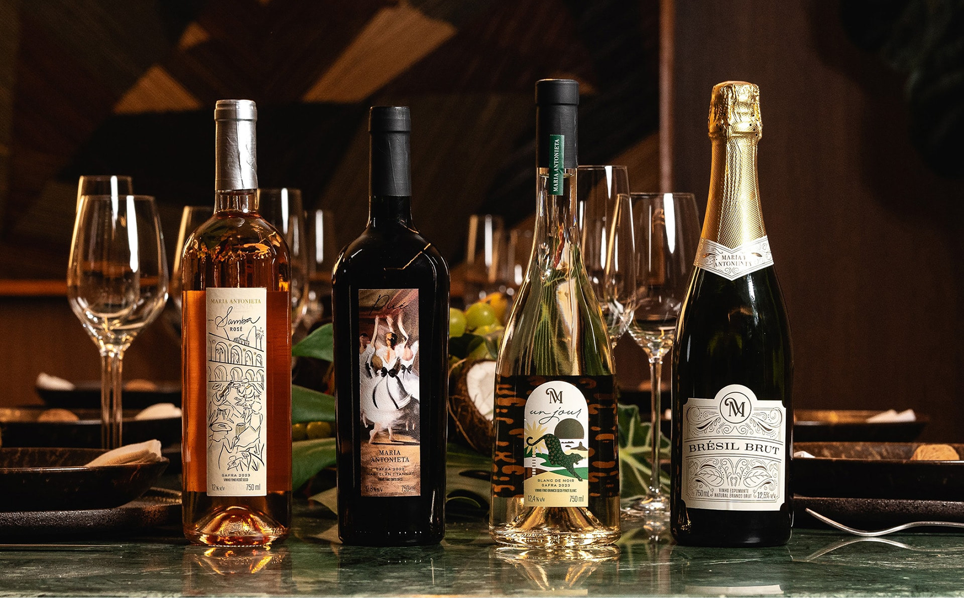
Despite each product line having its own character, the sense of luxury is present in every detail, from the quality of ingredients and recipes to the meticulous packaging finishes. This exchange between Brazil and France gives Maria Antonieta a distinctive and sophisticated identity, capable of sparking curiosity and admiration. The concept even came to life in unexpected ingredient pairings (pear, rosemary and cumaru) a perfect example of how this cultural mixture brought something fresh and surprising to the market.
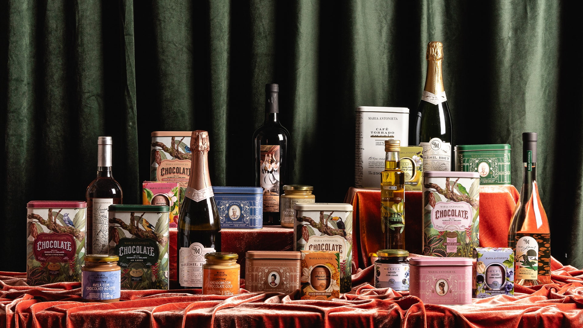
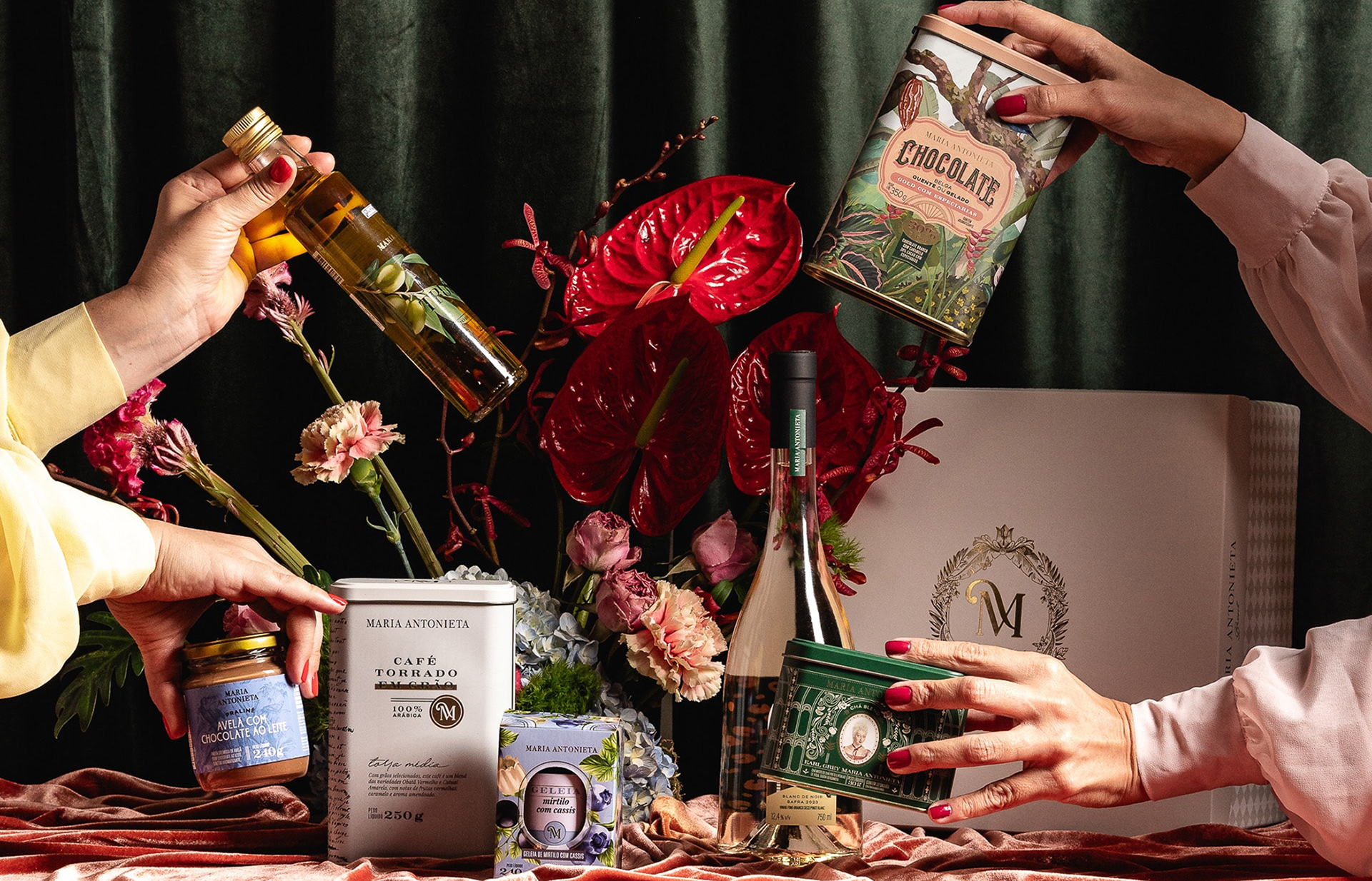
Each packaging design tells a story:
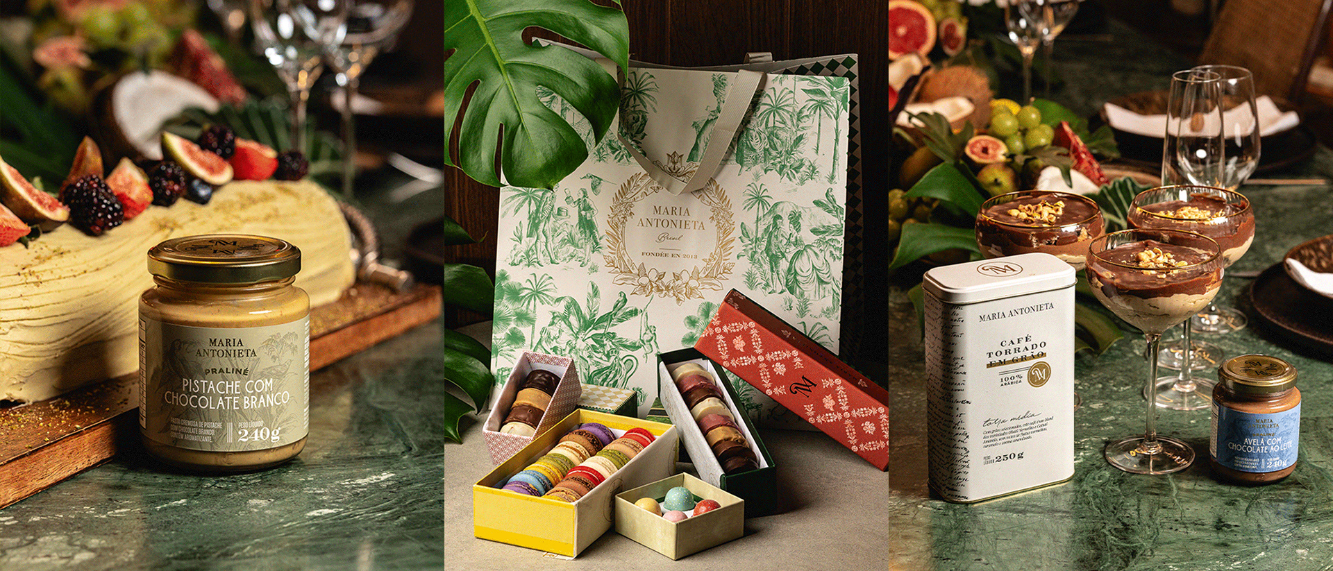
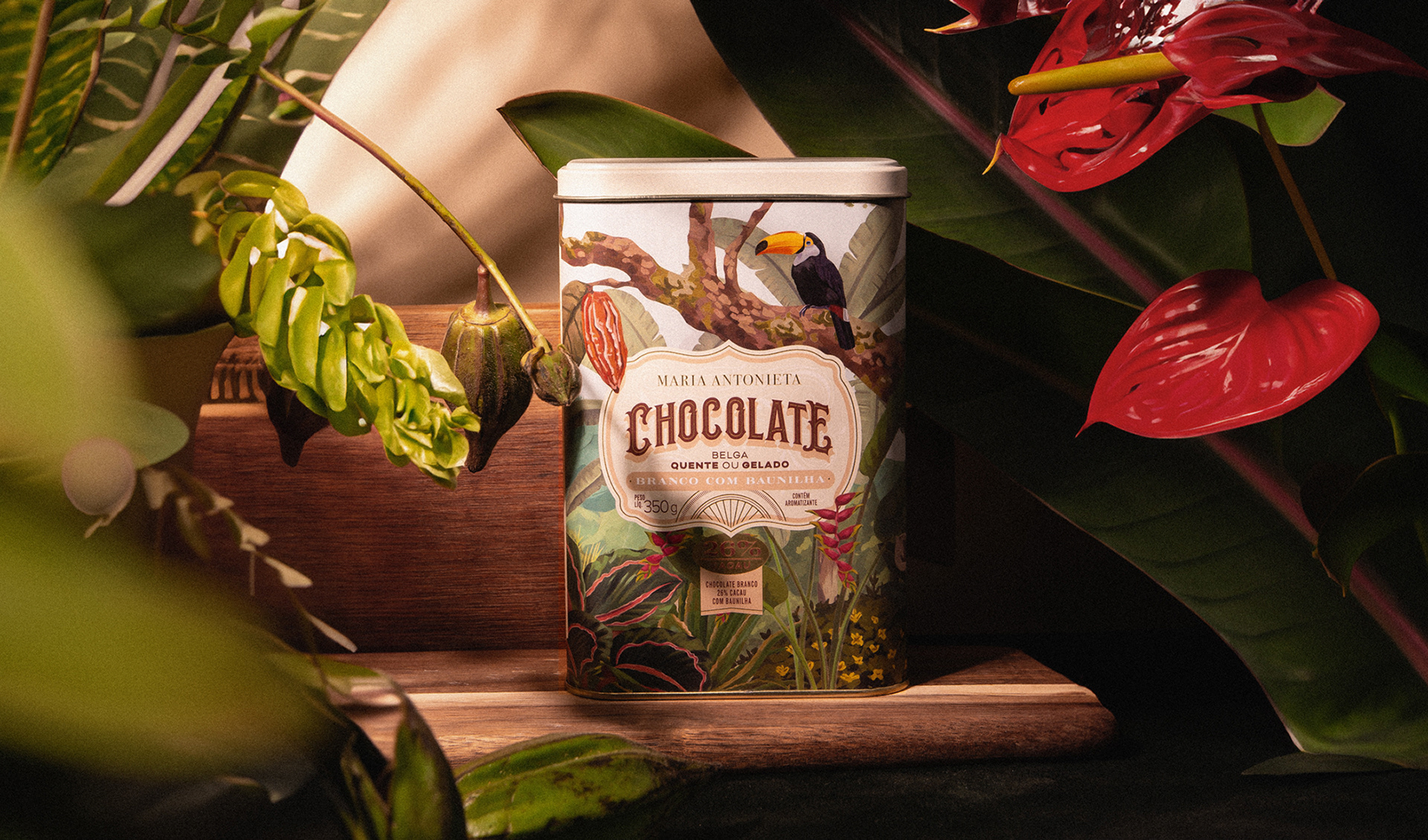
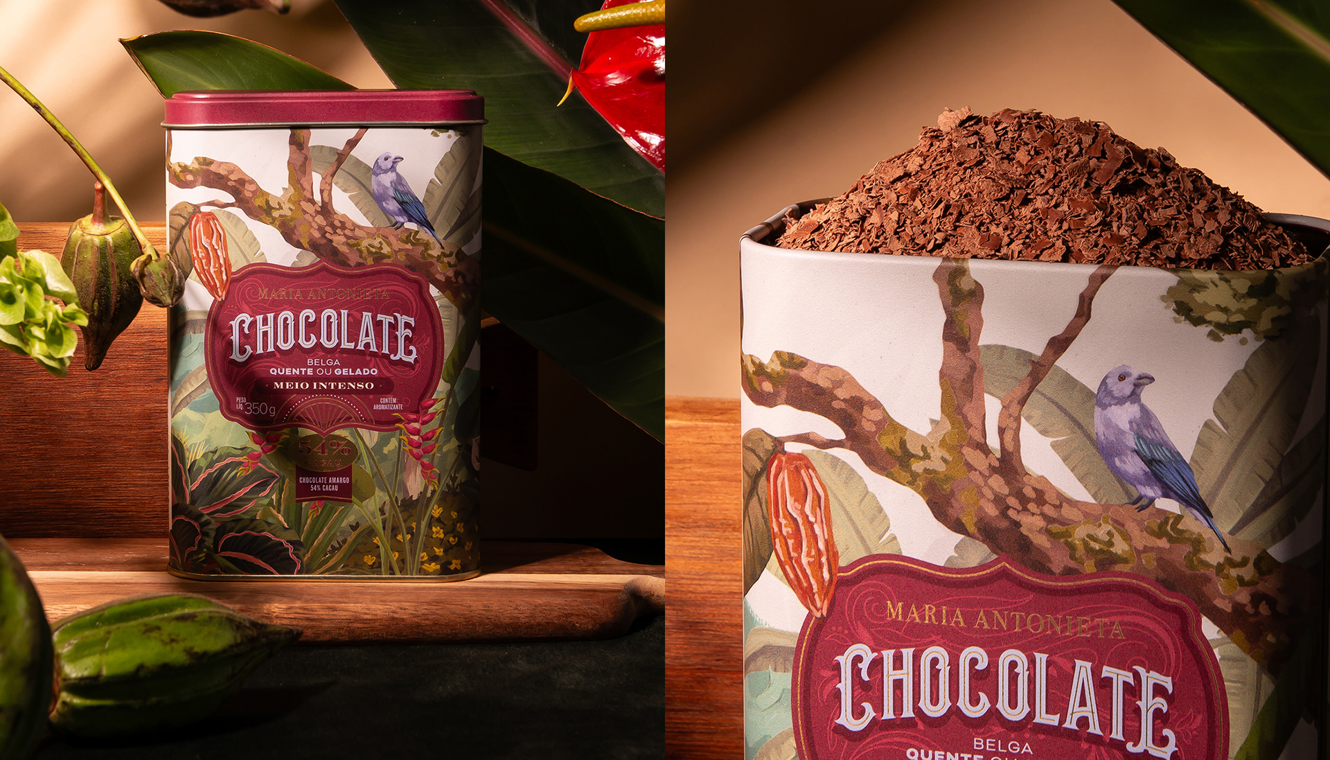
• The powdered chocolate tins feature intricate illustrations of Brazilian flora, complemented by elegant typography reminiscent of French refinement.
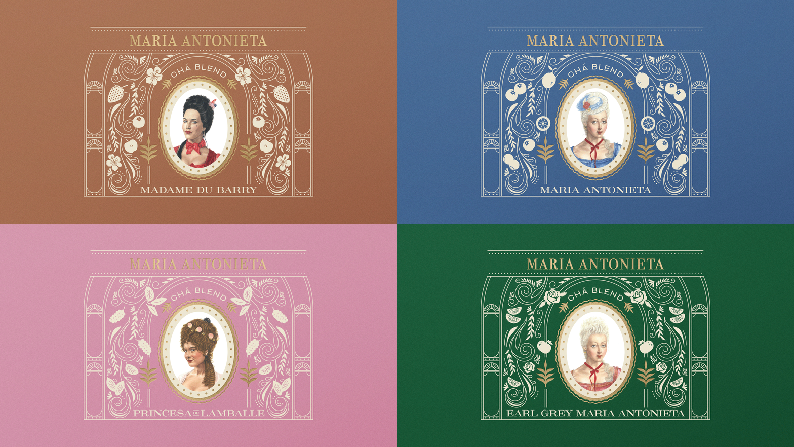
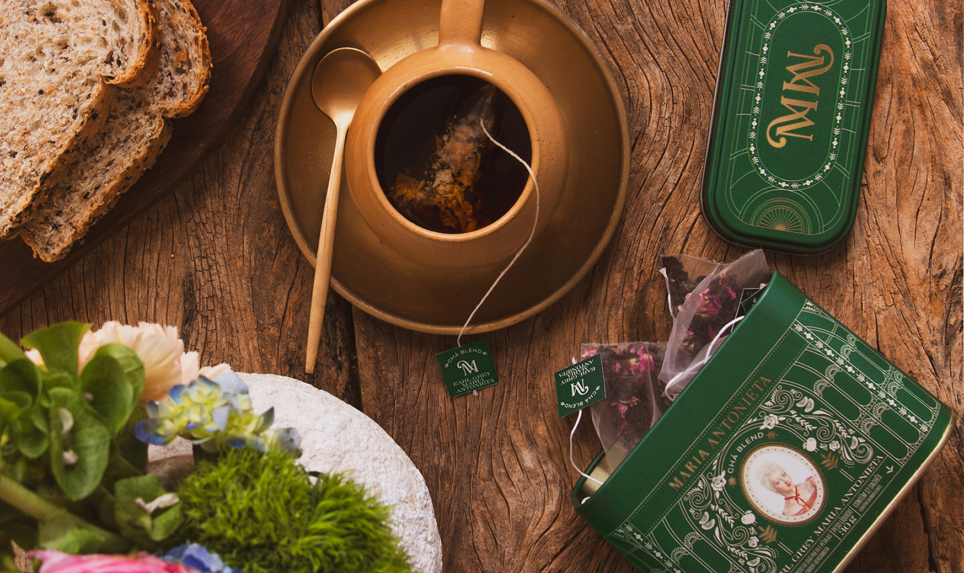
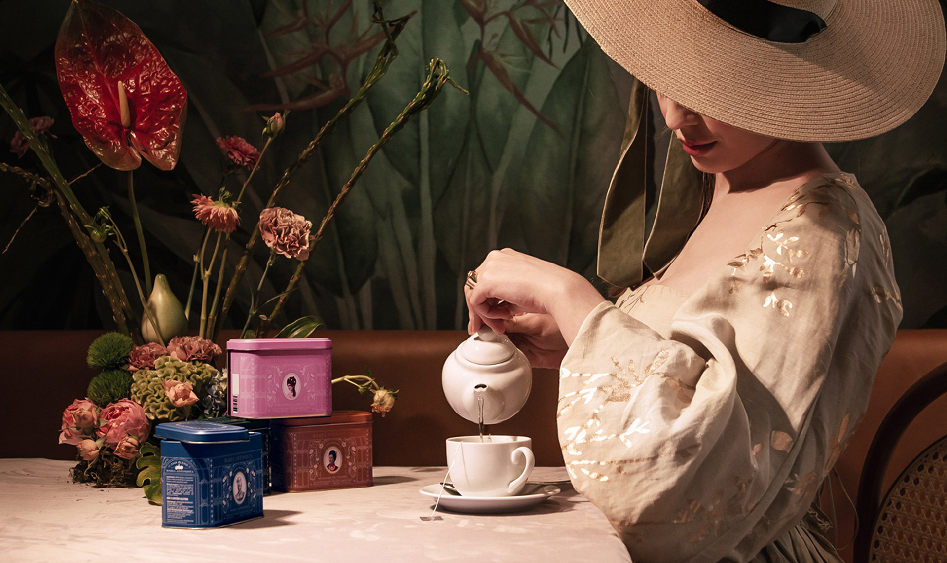
• The tea collection is adorned with Art Nouveau-inspired illustrations, evoking the beauty of European garden greenhouses.
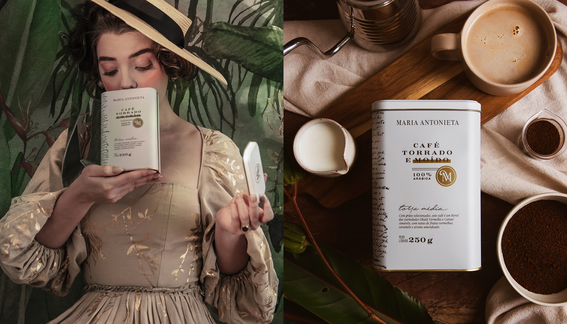
• The coffee packaging, inspired by the romance of Paris, is printed with a reproduction of a historic letter exchanged between Queen Marie Antoinette and Count Axel von Fersen.
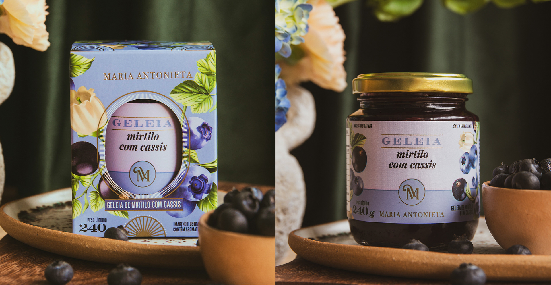
• The jam boxes reflect the harmonious blend of Latin and tropical ingredients with European flavors through elegant, refined illustrations.
The result is an extraordinary product portfolio, each piece is unique, yet all seamlessly connected, reinforcing the brand’s well-defined positioning. Whether launching a new product or creating a branded experience, we continue to craft a visual universe worthy of a luxurious and contemporary Franco-Brazilian banquet.
[PT]
IDENTIDADE VISUAL MARIA ANTONIETA
Ano: 2023/2024
Categoria: Alimentação
Categoria: Alimentação
Contexto
Com raízes francesas e alma brasileira, a Maria Antonieta é um encantador mix de bistrô, boulangerie, pâtisserie e chocolaterie, conquistando seus clientes com excelência há mais de uma década.
Com uma história rica e muito a comunicar, o proprietário Mateus Matana nos procurou para iniciar uma parceria de intensa troca criativa.
O que fizemos nesse projeto
Estratégia de Marca, Identidade Visual, Design de Embalagem.
Desenvolvimento
Criamos um conceito para essa nova fase da marca, imaginando como seria se a corte francesa tivesse se instalado no Brasil: “Francesa como sempre, brasileira como nunca”.
O reflexo desse posicionamento? Uma fusão sofisticada de ingredientes, sabores, tradições e culturas, trazendo o melhor desses dois mundos para os exigentes consumidores da marca, que valorizam a história e o status que a marca transcende. Essa alegoria inspirou todas as nossas criações, desde a nova identidade visual até as embalagens e demais pontos de contato.

Brand Strategy, Visual Identity and Packaging Design Projects: MELT Design
(Marjorye Cavazotto, Juliana Zarattini, Rodrigo Lourenti, Caroline Celli, Júlia Bossi, Giovana Franciscon, Raquel Silveira, Karina Bartra, Kaue Marques, Nathalie Portela and Stenio Von Zuben)
Videos: Vini Bernardes, Lucas Moretto and Igor Braga
Shoot Production and Direction: We+Aste+Risk+You
Photography: Estúdio Figo and Lucas Moretto
Watercolor Illustration of Characters: Fepe Camargo
(Marjorye Cavazotto, Juliana Zarattini, Rodrigo Lourenti, Caroline Celli, Júlia Bossi, Giovana Franciscon, Raquel Silveira, Karina Bartra, Kaue Marques, Nathalie Portela and Stenio Von Zuben)
Videos: Vini Bernardes, Lucas Moretto and Igor Braga
Shoot Production and Direction: We+Aste+Risk+You
Photography: Estúdio Figo and Lucas Moretto
Watercolor Illustration of Characters: Fepe Camargo